SwiftUI Animation techniques
From basic to advanced
One of the main reasons iOS feels so good to use is its fluent animations. Looking at successful apps, you would many times find these subtle but powerful animations.
While UIKit offers truly powerful APIs for creating animations, SwiftUI takes it a step further offering APIs of its declarative nature that anyone can learn and use in no time making creating wonderful apps easier than ever.
The basics
When looking for the simplest way of adding animations to an app, one would learn very early on how to work with the animation modifier and the withAnimation function.
Changing a state within a withAnimation call will result in all the views depending on that state animating to their new appearance. How the animation is performed depends highly on the view that is being animated and the state that changes.
💡 To learn more, check out this article where we have dove deeper into the
Animatableprotocol
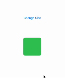
@State private var size: Double = 100

var body: some View {
    VStack(spacing: 100) {
        Button("Change Size") {
            withAnimation(.bouncy) {
                size = size == 100 ? 200 : 100
            }
        }
        RoundedRectangle(cornerRadius: 10.0)
            .fill(.green)
            .frame(width: size, height: size)
    }
}
When you don’t want to write withAnimation over and over again, you can use the animation modifier. This modifier offers an easy to use API for customizing how the change of each state should be animated.
⚠️ Note that using animation will force your view to always animate so I would recommend only using it when you are 100% sure that in no case will you need to have the view without the animations or with different ones. For example when encapsulating app wise styles
@State private var size: Double = 100

var body: some View {
    VStack(spacing: 100) {
        Button("Change Size") {
            size = size == 100 ? 200 : 100
        }
        RoundedRectangle(cornerRadius: 10.0)
            .fill(.green)
            .animation(.bouncy, value: size)
            .frame(width: size, height: size)
    }
}
Both of the examples will have the following outcome, the difference exists only at code level
The advanced stuff
The animation methods we have looked so far don’t offer much control over how you view should get from one state to the other, all they do is describe the nature of the animation (smooth, bouncy, etc) In this next section, let’s look at the options we have for building highly customized animations, like the following one:

PhaseAnimator
The first step in our journey is the PhaseAnimator . To understand it better, try to think of your animation as a series of phases it goes through. Let’s take this simple animation with just three phases
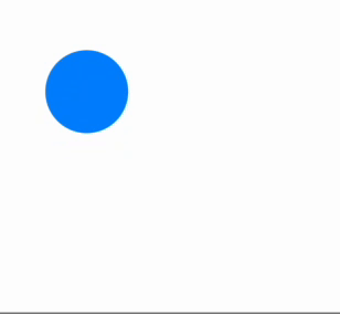
As you can see, our circle moves up, to the right then back to it's initial position. I like to think about phases as the different states the view can be in, since our job is only to describe what the view would look like if we just stoped the animation in any given phase. Let’s see the code for it:
Circle()
    .fill(Color.blue)
    .frame(width: 50, height: 50)
    .phaseAnimator([1,2,3]) { content, phase in
        content
            .offset(x: phase == 3 ? 100 : 0,
                    y: phase == 2 || phase == 3 ? -100 : 0)
    } animation: { _ in
            .spring(duration: 1)
    }
Note the phaseAnimator modifier. Its first parameter is a list of Equatable elements to represent the different phases. For simplicity, we are using a list of Ints however in the next example we will see how using an enum may be a way better idea.
The next parameter is where we can construct our animation. The content builder receives the base view and the current phase and has to return a View. This provides huge flexibility since just like in most places in SwiftUI, anything that is a view can be returned from here. The phase animator modifier will call our content builder for each phase, one by one, and animate the view between the different states
The last (optional) parameter can be used to specify the animation to be used. It also receives the current phase so we have fine control over each phase’s animation.
In the following, more complex example we can identify the following phases: still, prepareForGrowing, growing, prepareForRotation, rotate, revertRotation

Let’s see the code. First, we are going to create an enum to describe the phases identified above. We can use computed properties to define the different values we are animating between phases
enum Phase: CaseIterable {
    case still
    case prepareForGrowing
    case growing
    case prepareForRotation
    case rotate
    case revertRotation

    var verticalStrech: Double {
        switch self {
        case .growing: 1.2
        default: 1
        }
    }

    var horizontalStrech: Double {
        switch self {
        case .prepareForGrowing: 1.2
        default: 1
        }
    }

    var verticalOffset: Double {
        switch self {
        case .prepareForGrowing: 20
        case .growing, .prepareForRotation, .rotate, .revertRotation: -100
        default: 0
        }
    }

    var scale: Double {
        switch self {
        case .growing, .prepareForRotation, .rotate, .revertRotation: 2
        default: 1
        }
    }

    var rotation: Angle {
        switch self {
        case .prepareForRotation: .degrees(-20)
        case .rotate: .degrees(360)
        default: .degrees(0)
        }
    }
}
This was the hardest part. The animation itself becomes pretty straight forward thanks to the phase animator
Text("🤩")
    .font(.system(size: 50))
    .phaseAnimator(Phase.allCases) { content, phase in
        content
            .rotationEffect(phase.rotation)
            .scaleEffect(x: phase.horizontalStrech, y: phase.verticalStrech)
            .scaleEffect(phase.scale)
            .offset(y: phase.verticalOffset)
    } animation: { _ in
        .bouncy
    }
As you can see, the outcome is a very nice, fluent animation. SwiftUI even takes care of the transitions between the different phases so the results are as fluent as possible.
The only downside of using a phase animator is the lack of fine control in timing. Look closely how our emoji shoots up. To add to the effect, we added a bit of vertical stretch, however the effect lasts a bit longer than needed. It’s a subtle detail but sometimes it is all it takes to make or brake the illusion. To solve this, we would need to add an other phase representing the last fraction of the growing animation in which our emoji would grow a tiny bit more but already without any vertical stretch.
As you can imagine, our code gets really complex really soon. This is when KeyframeAnimator comes into play.
The KeyframeAnimator
Using a keyframeAnimator is just as simple as using a phaseAnimator however the grater control comes with its price. In this case, this price is the complexity of calculating the correct keyframes. Let’s see what we are building. This animation is similar to the previous example but adds those small details mentioned before.

For this animation, instead of identifying the different phases we will have to come up with all the timestamps when a certain value changes. After calculating everything, this is what we get
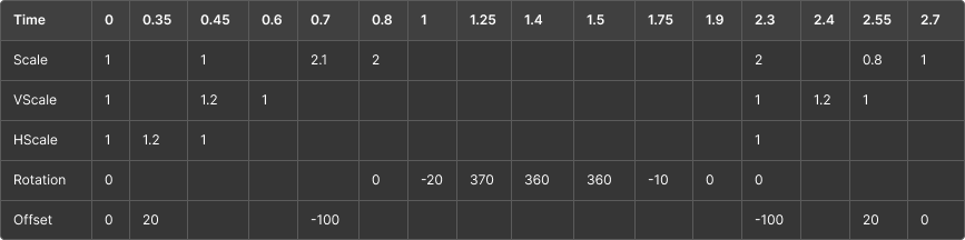
The top row has the time by which a property changes from one value to the next one. This concept is explained in more details below. But first, let’s see the code. To start, we need to represent our values in a struct
struct AnimationValues {
    var rotation: Angle = .degrees(0)
    var horizontalStrech: Double = 1
    var verticalStrech: Double = 1
    var scale: Double = 1
    var verticalOffset: Double = 0
}
During our keyframes, we will work with the different properties of this struct. The modifier to be used is very similar to the phaseAnimator
Text("🥳")
    .font(.system(size: 50))
    .keyframeAnimator(initialValue: AnimationValues()) { content, values in
        content
            .rotationEffect(values.rotation)
            .scaleEffect(x: values.horizontalStrech, y: values.verticalStrech)
            .scaleEffect(values.scale)
            .offset(y: values.verticalOffset)
    }  keyframes: { _ in
    // ..
    }
As you can see, the first parameter of the modifier is the initial values of the animation. The second one is the content builder. This is very similar to the previous example, except the content builder receives the current value instead of the current phase. This makes the builder even simpler as we can simply use the values directly
The next parameter is the callback creating the keyframes. Let’s see the code for this
{ _ in
    KeyframeTrack(\.verticalOffset) {
        LinearKeyframe(0, duration: 0.1)
        CubicKeyframe(20, duration: 0.25)
        CubicKeyframe(-100, duration: 0.35)
        LinearKeyframe(-100, duration: 1.6)
        CubicKeyframe(20, duration: 0.25)
        CubicKeyframe(0, duration: 0.15)
    }
    KeyframeTrack(\.horizontalStrech) {
        LinearKeyframe(1, duration: 0.1)
        CubicKeyframe(1.5, duration: 0.25)
        CubicKeyframe(1, duration: 0.1)
    }
    KeyframeTrack(\.verticalStrech) {
        LinearKeyframe(1, duration: 0.35)
        CubicKeyframe(1.5, duration: 0.1)
        LinearKeyframe(1.5, duration: 0.1)
        CubicKeyframe(1, duration: 0.05)
        LinearKeyframe(1, duration: 1.7)
        CubicKeyframe(1.5, duration: 0.1)
        CubicKeyframe(1, duration: 0.15)
    }
    KeyframeTrack(\.scale) {
        LinearKeyframe(1, duration: 0.45)
        CubicKeyframe(2.5, duration: 0.20)
        CubicKeyframe(2, duration: 0.15)
        LinearKeyframe(2, duration: 1.5)
        CubicKeyframe(0.8, duration: 0.25)
        CubicKeyframe(1, duration: 0.15)
    }
    KeyframeTrack(\.rotation) {
        LinearKeyframe(.degrees(0), duration: 0.8)
        SpringKeyframe(.degrees(-20), duration: 0.2, spring: .bouncy)
        SpringKeyframe(.degrees(370), duration: 0.25, spring: .bouncy)
        SpringKeyframe(.degrees(360), duration: 0.15, spring: .bouncy)
        LinearKeyframe(.degrees(360), duration: 0.1)
        SpringKeyframe(.degrees(-10), duration: 0.25, spring: .bouncy)
        SpringKeyframe(.degrees(0), duration: 0.15, spring: .bouncy)
        LinearKeyframe(.degrees(0), duration: 0.4)
    }
}
For every property that needs animation, we can add a KeyframeTrack using a KeyPath . Keyframes inside a track are “played” in the order they are declared. To understand how they work, take this smaller example first:
KeyframeTrack(\.rotation) {
    LinearKeyframe(.degrees(0), duration: 0.8)
    SpringKeyframe(.degrees(-20), duration: 0.2, spring: .bouncy)
}
This bit of code translates to the following sentence: Keep rotation at 0 degrees for 0.8 seconds, then animate it to -20 in 0.2. The outcome of this is a 1 second long animation that stands still for 0.8 then starts to rotate and gets to a -20 degrees rotation by the time the animation is at the 1 second mark
⚠️ Note that the keyframe animator doesn’t automatically revert the state. You are responsible for getting the values back to their initial state otherwise the view will snap back to the beginning of the timeline
💡 Quick tip: The result builder used for the keyframes parameter produces a
KeyframeTimeline. This handy type can be used anywhere in code to get values from the timeline for any timestamp like so:
let keyframes = KeyframeTimeline(initialValue: CGPoint.zero) { ... }
let value = keyframes.value(time: 0.45)
The different keyframe types
SwiftUI comes with a couple of different keyframe types that control how the values are animated. The ones used in this tutorial with their explanations are below:
- Linear: Constant speed.
- Spring: Bouncy, with overshoot and settling.
- Cubic (easeIn/out/inOut): Smooth acceleration and/or deceleration.
What’s next
In this article we have covered some of the most common animation types in SwiftUI. These tools offer an easy to use yet powerful API for achieving the visual excellence, however if you wish to dive deeper and learn how to draw custom UI elements and animate them effortlessly, check out this previous article of mine.
Related articles
Here are some more articles that may interest you. Check them out!
The TimelineView
published on November 2, 2025
SwiftUILearn how to use SwiftUI’s TimelineView to build time‑based animations. This article explains scheduler options, shows practical examples (pauseable clock, smooth minute‑progress ring with hue shifts and tick marks), and helps you choose the right schedule for smooth or precise updates.
Read moreContainer Relative Frame
published on September 18, 2025
SwiftUILearn how to use the containerRelativeFrame modifier in SwiftUI to create proportional layouts. This article explains both variants of the modifier, how containers are determined, and provides practical examples for building flexible, responsive UIs.
Read moreFoundation Models
published on October 8, 2025
SwiftAILearn how to use Apple’s foundation models to run large language models locally on iOS. This article covers chat, streaming responses, structured data generation, and custom tools, helping you build secure and responsive AI features without relying on the cloud.
Read more